Overview
Tabletop Trove is an e-commerce mobile-web experience that offers a tailored browsing experience to board game enthusiasts of any level to quickly and easily find a board game.
Duration:
4 Weeks
My Role:
Solo UX/UI Designer
Design Challenge
Tabletop Trove users typically abandon the site and cart
Tabletop Trove recently launched as a mobile-web e-commerce platform that sells board games and tabletop products. With the rise of technology and especially from the COVID-19 pandemic, many people have been craving to disconnect from the screen and stay connected with others face-to-face through board games. As a result, the company wants to capitalize on the resurgence of board games by improving the conversion from browsing to checkout completion to increase revenue. The project manager provided me with the following data:
50% of users open on average 7 item pages, but abandon the site without adding any items to the cart.
70% of users who add an item to a cart eventually abandon the cart with a possible culprit due to requiring users to make an account to purchase.
The goal of the project was to generate and test solutions by the end of the month. This gave me a month to discover, design, and validate the mobile-web experience.
Problem Statement:
How to improve browsing to checkout conversion?
The Solution
Design Process
Screener Survey
Pinpointing my potential user base and their tendencies
Statistical data revealed how users mainly abandon their cart due to assessing need vs. want, overall costs, and deal quality. When it came to what helped users who browsed and bought board games, most mentioned research and recommendations utilizing an external platform (Youtube, Tiktok, Reddit, BoardGameGeeks.com, etc.). This led me to filter out my potential interview subjects based on 33 respondents who actually browsed and purchased a board game online.
Cart Abandonment during Checkout
Board Gaming Frequency
Board Game Shopped Online and Purchased
User Interviews
Five potential users were selected to uncover product browsing, checkout pain points, and shopping mindstate trends
Research Questions
What are the main pain points that users encounter during the browsing experience on the e-commerce platform?
How do users navigate the platform's product categories and filters, and are there any issues or confusion in this process?
What information do users look for when researching and selecting board games, and how can the platform best provide this information?
What are the reasons behind users abandoning their carts during the checkout process, and how can these issues be addressed to increase completion rates?
What are users' expectations for the registration process, and how can the platform's guest checkout process meet those expectations?
What design changes or improvements can be made to the platform to improve the overall user experience and increase the likelihood of completing a purchase?
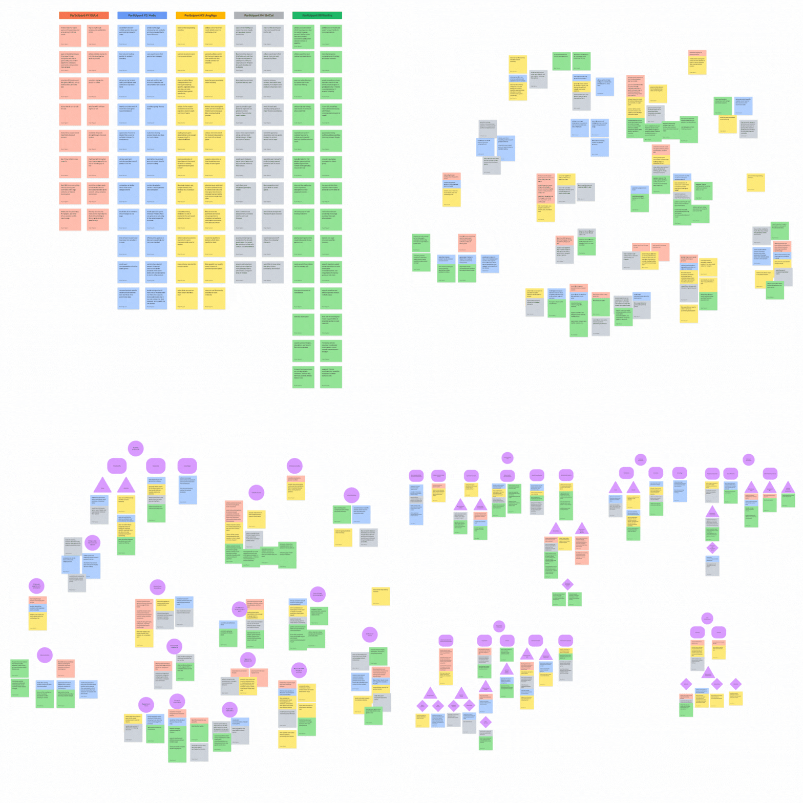
Affinity Mapping
Four factors associated with successful purchases
1. Word of Mouth
Board game shoppers highly consider recommendations from word of mouth and are associated with utilizing the search bar the most when it comes to browsing.
“Most of the board games I buy, 90% of them are from friends' recommendations… I trust my friends… pretty similar and are on the same page.” -KT
2. Familiarity
Users are accustomed to general e-commerce design patterns regarding browsing and checkout.
3. Comprehensive
People expect to find all the board game information easily in a concise, convenient, and visual way without leaving the platform to consider purchases.
4. Bonuses
People would feel enticed to checkout if provided with limited discounts or bonus items included with the purchase.
“A coupon will always work...it works really well…helps gamify things..” -EA
User Personas
Designing with casuals and enthusiasts in mind
Focusing on the idea of how different kinds of board gamers yield different browsing and buying preferences, my user interview data led to the categorization of casual and enthusiast board gamers. Both users would have similar search and purchase mindsets, but the main difference is during the product assessment if an item is worth buying or not. These personas mainly focused on goals, motivations, needs, frustrations, and personality traits to help guide UX goals and discover product opportunities.
Competitor Insights
Current platforms lack comprehensive product details
As I analyzed three common board game e-commerce sites, I reminded myself to assess how these sites approached selling board games. All of the platforms provide varying levels of a board game’s product information. Still, they all fail to provide encompassing details for a product (such as gameplay videos, trustworthy reviews, etc.) This then became my opportunity to focus on this niche to provide a comprehensive product page to keep users on the platform.
HMW ?’s
Reframing my insights to ideate design opportunities
How might we concisely, visually, and neatly provide comprehensive product info to keep users on the platform
How might we encourage users to swiftly checkout
How might we integrate a social aspect to encourage board game spending
User Flows
Must have e-commerce flows: Product Browsing and Checkout
Based on the main features and data listed, I created two major red routes that are vital user flows for my mobile-web experience. The purpose of mapping my user flows is to help formulate and visualize my ideas to help decide the amount and order of screens.
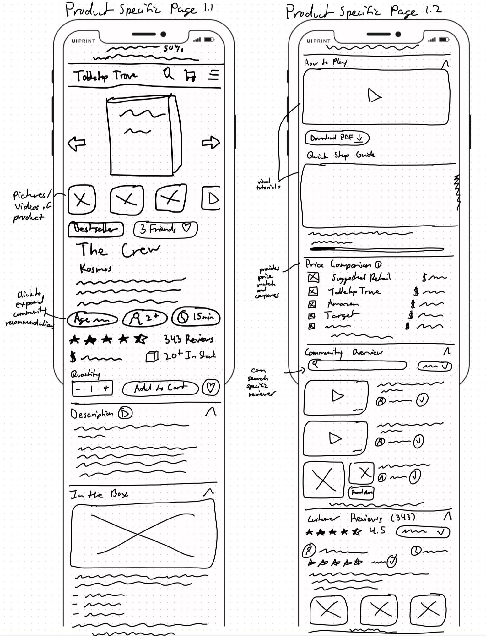
Sketching
Comprehensive product info is emphasized in the sketches
My focus was on envisioning the product-specific page since it would be the main emphasis for the e-commerce experience. To warm up, I did Crazy 8s to generate ideas prior to sketching out the rest of my screens in more detail.
Mid-Fi Wireframes
Jumped straight to mid-fi wireframes to make quick edits and provide realism, leading to better quality feedback
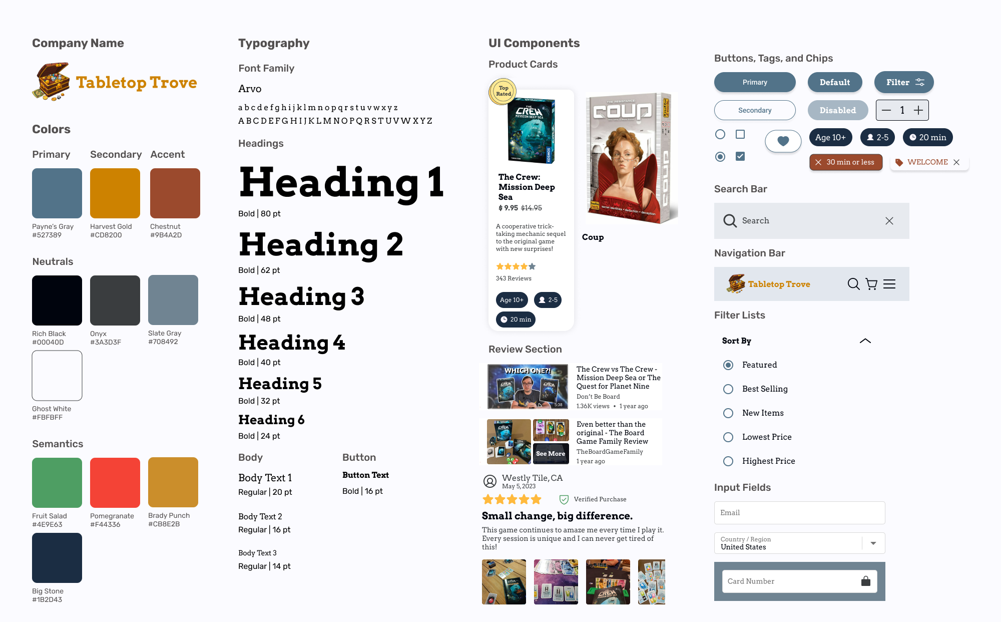
Branding & Style Guide
A unique treasure theme resonating with the brand’s personality and attributes
I selected Arvo for its modern text clarity while providing a touch of personality and excitement, like finding actual treasure. Regarding the color palette, I utilized varying shades of gray-blue to reflect reliability and intelligence. Secondary colors gold and chestnut both provide an association to treasure by giving a sense of luxury and adventure.
Usability Testing
Gaining shopping insights
I conducted 2 rounds of scenario-based usability testing interviewing a total of 10 people via Zoom. All of my participants were potential users from my screener survey, allowing me to test how accommodating the app is to both user personas. Each test allowed me to gather crucial design feedback and uncover unforeseen confusion to help me iterate my initial prototype.
Scenario-Based Tasks:
Navigating to the recommended product page.
Utilizing filters to better find products within criteria.
Checking out and purchasing the product.
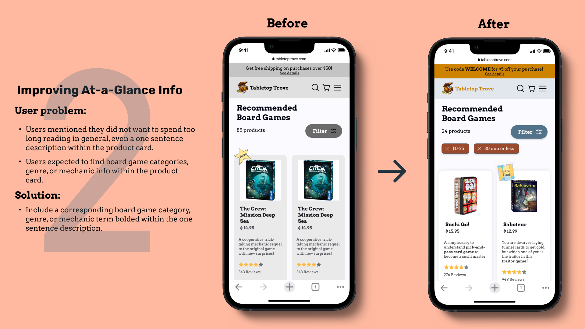
Iterations
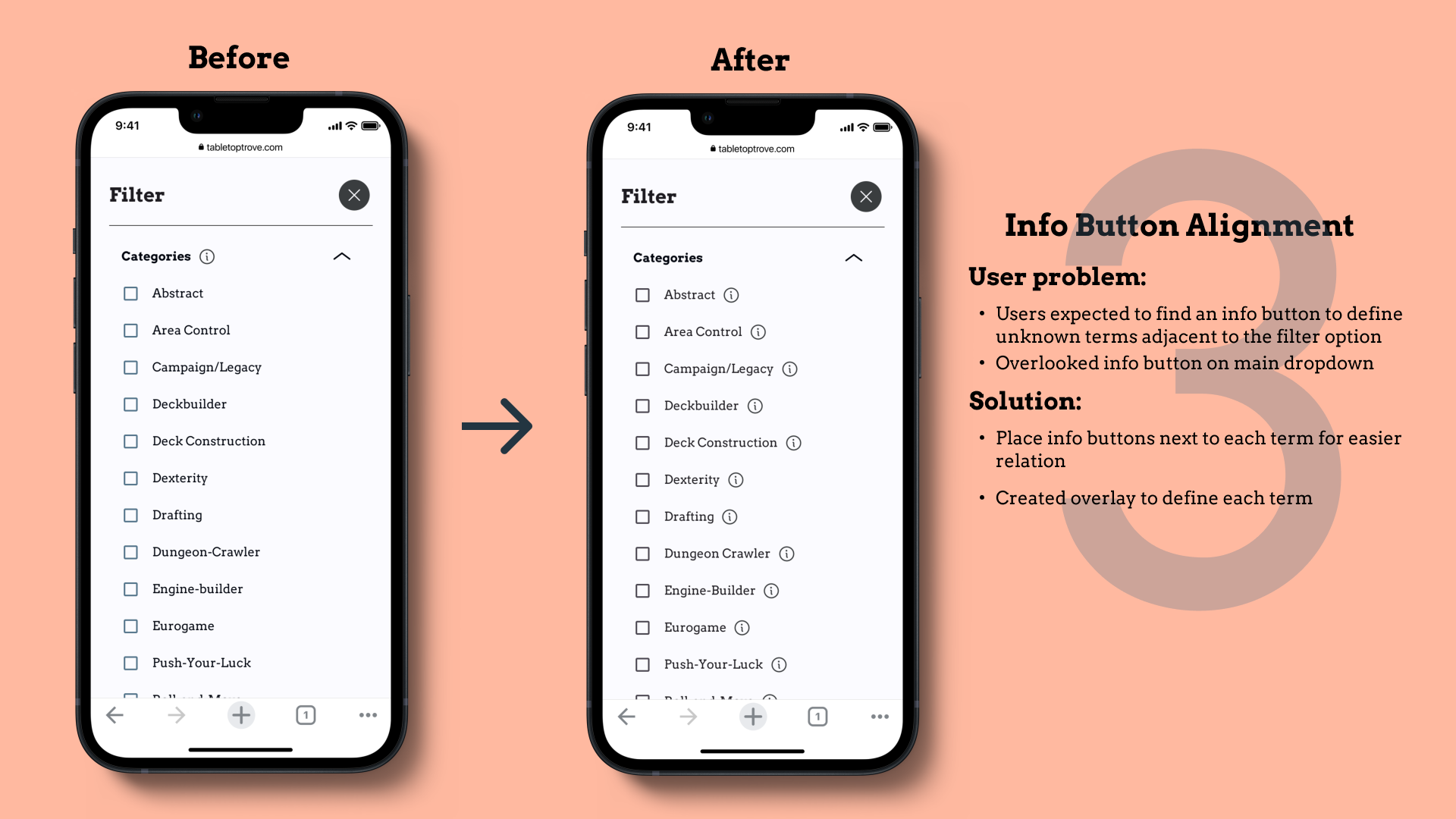
Three main improvements based on usability tests
Prototype
Try to find some board game treasures yourself!
Positive Results
“Everything is pretty streamlined.” -TN
Overall, the user responses were very positive towards both rounds of testing. Users stated Tabletop Trove equipped them with comprehensive information if not more than they would need to decide whether or not to purchase a board game. Despite the positive tests, more testing is required to assess the latest changes and to implement more features to further increase sales.
All of the users mentioned the site as comprehensive and simple.
100% of participants were able to complete each task.
High rate of overall satisfaction for all users.
The mean time of new users going through the checkout process: 1 minute and 51 seconds.
Reflections
Considerations for next time…
I really enjoyed my time working on this project because it was something I was passionate about. If I had the chance, I would want to continue turning this project into a real product. Aside from that, here are some of the insights I came away with for the next project:
Timebox and follow the plan.
This was the first project I laid out my own strict project plan. Breaking down the entire design process from the beginning helped me to maintain an adequate pace and keep myself accountable for my goals. I now realize the true power of creating a detailed project plan and shall utilize it from here on out.
Components are your best friends.
When it came time to design the middle fidelity wireframes, I had a lot of product details and content to include for board games. With so many pieces to create for my product page, I created components and variants that opened my eyes to how efficient components are. From now on, I plan to build a component library to simplify and fast-track my output.
Realize the difference between business and UX goals.
Throughout the usability testing process, I wanted to implement lots of feedback. However, I had to remind myself that some suggestions provided were purely from a business standpoint that I did not have control over, since Tabletop Trove was constantly being assessed against Amazon. It made me really consider and separate business operations out of my control and focus on usability in my design.
Next Steps
Conduct another usability test to validate the design changes and incorporate feedback.
Prepare the design for developer handoff.
Develop a more in-depth, interactive community ecosystem for the next update to help cater to enthusiasts and potentially increase sales because users heavily consider word of mouth for board game purchases.


