
Overview
Bridging the gap between patients, clinicians, and pharmaceuticals for holistic asthma care.
Duration:
4 Weeks
My Role:
UX/UI Designer
Communications Lead
Project Lead
Team:
2 Other UX/UI Designers
The Challenge
Creating an integrative telemedicine feature as one of the remaining priority features
With onboarding and a homepage already built, the founder now wants to add a comprehensive telemedicine feature. This required an understanding of the company’s vision, evaluation of other telemedicine apps, and maintaining an intuitive yet familiar design to align with the previously created flows.
Problem Statement:
How to create a comprehensive yet familiar telemedicine feature that aligns with existing designs?
The Solution


Design Process
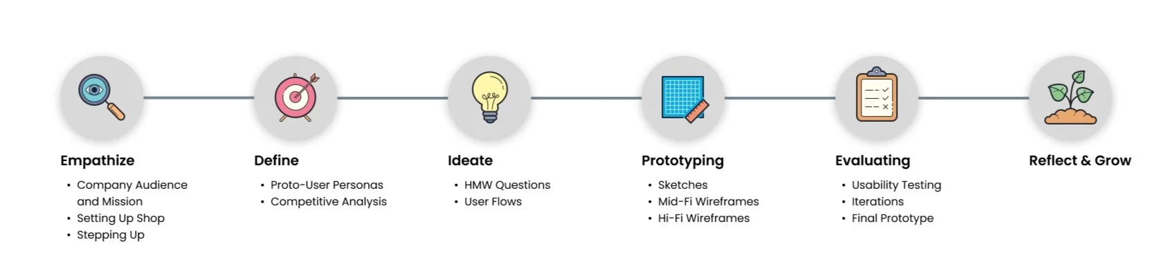
Company Audience and Mission
Bridging the gap between asthma patients and their clinical care team
Treatment for those with asthma, chronic obstructive lung diseases, etc. often involves inhalers. A wide range of patients of varying ages have poor inhaler compliance and approximately 94% of total people misuse their inhalers, resulting in about 1000 asthma deaths daily. To mitigate such statistics, medical device startup company Purcell Global plans to create smart inhalers and an accompanying app with comprehensive features to bridge the gap between respiratory patients and their clinical care team.
Setting Up Shop
Understanding the problem
Early on, our team conducted extensive meetings with the founder to gather existing design and business knowledge. Reviewing branding, previous user research, and onboarding/dashboard flows helped us establish requirements, objectives, and fostered familiarity with each other. Initially planning to merge existing flows, Purcell then shifted focus towards prioritizing creating a telemedicine feature instead, aiming to position itself as a comprehensive asthma care app. The founder established the following main tasks to consider as we progress through the project:
Emphasize simplicity and intuitive designs towards patients rather than clinically focused.
Create main telemedicine tasks with the following features: Setting up telemedicine appointments, requesting medication refills, and accessing electronic medical records.
Maintain design consistency across previous teams.
Stepping Up
Taking initiative for communications and project lead
In my role, I took responsibility for executing logistical coordination and communication across time zones, scheduling meetings, and serving as the representative speaker in discussions with the CEO. Taking the initiative to lead and ensure team accountability, I created a comprehensive Notion To-Do list with task breakdowns and proposed deadlines. All of this ensured everyone was on the same page.

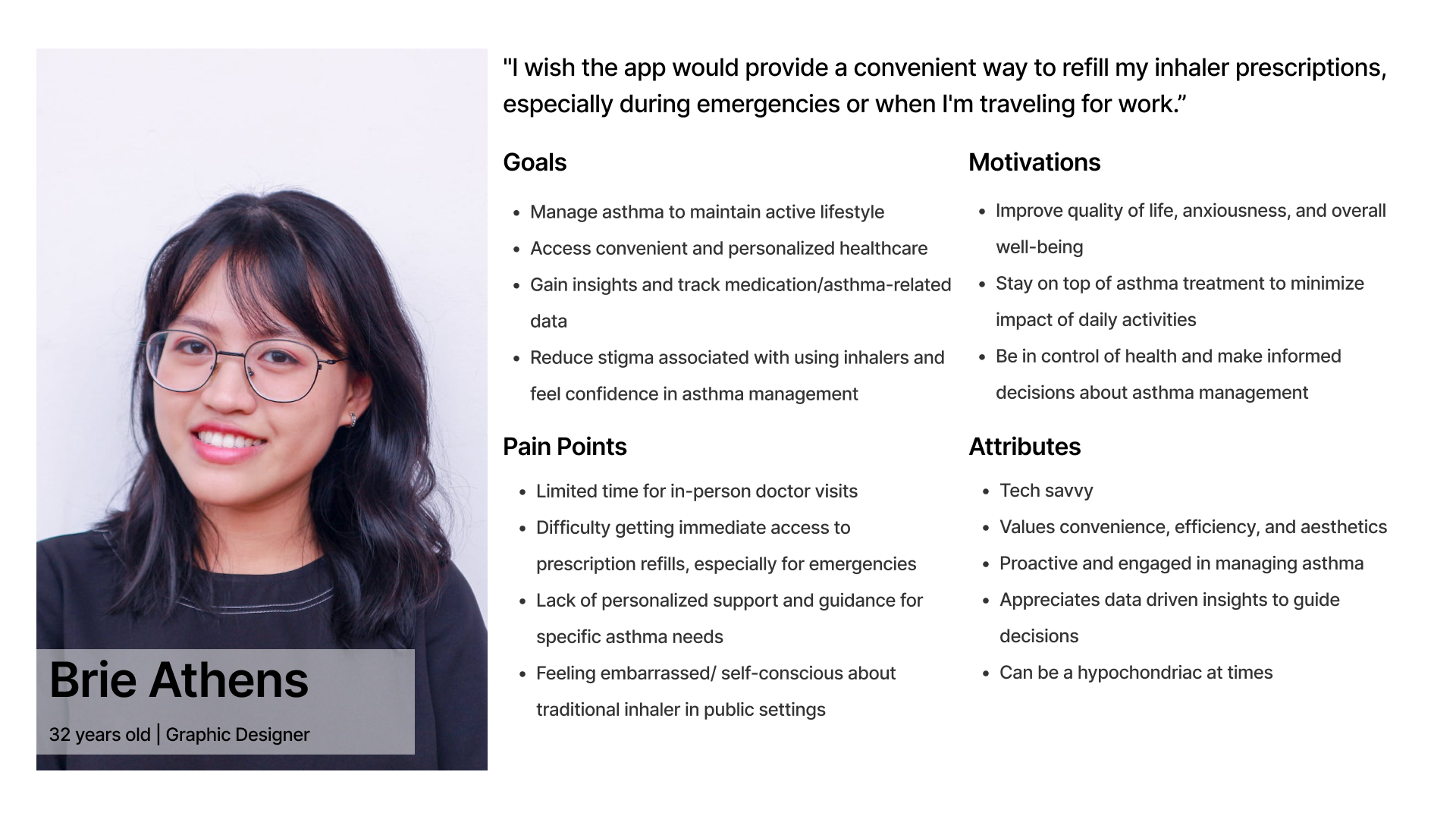
Proto-User Personas
Designing with anxious and non-compliant users in mind
With a wide age range of potential users with respiratory diseases and utilizing prior potential user research, it suggested target users are likely to be technologically inept, but the main difference is with their compliance. Regarding compliance, typical non-compliant patients utilize their emergency inhaler instead of their routine inhaler for control. Thus, I created two proto-user personas for the team to reference when ideating: the hypochondriac user (medication compliant, but highly anxious about condition) and the busy bee (struggles with compliance and needs extra guidance).

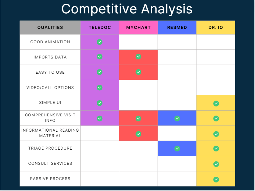
Competitor Insights
I scoped out two telemedicine competitors for the team
Analyzing two popular telemedicine apps, I reminded myself to assess how these sites approached telemedicine as a whole. Both telemedicine apps focused on ease of use and simplicity, likely due to the wide range of users. However, they both required too many pages of user inputs to carry out actions, such as scheduling calls, viewing medical records, etc.
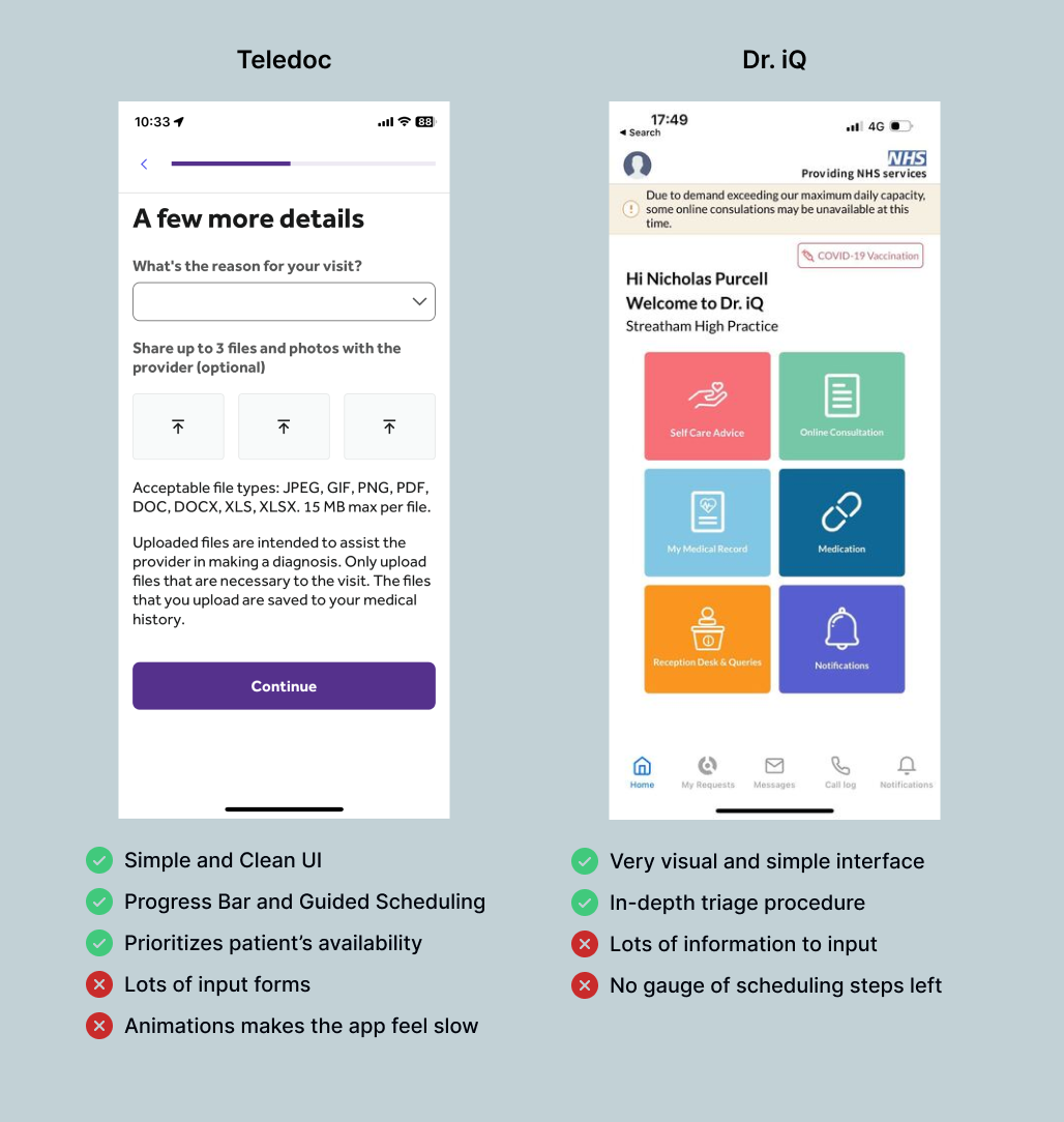
Combining my other groupmates’ competitive analysis for a total of four apps, we mutually agreed that our telemedicine feature should have the following qualities:
Simple and intuitive design
Comprehensive access to health records
Utilize a preliminary assessment for scheduling doctor calls
Options between video or voice call
HMW ?’s
Pondering questions to help ideate design opportunities
How might we effectively screen patients for respiratory vs non-respiratory medical needs for telehealth appointments to better specify a reason for the visit?
How might we easily allow patients to create, reschedule, and cancel telemedicine appointments with physicians to allow flexibility?
How might we allow patients to easily access their telehealth medical history to stay on top of their asthma?
How might we intuitively connect patients with doctors when they require care?
User Flows
The scope was wider than initially realized
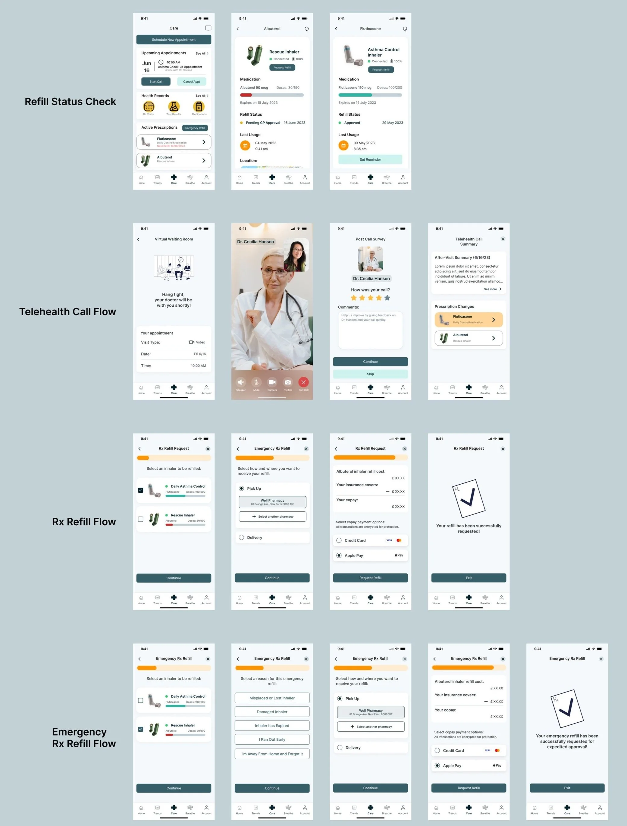
Utilizing HMW questions, we developed individual user flows and iterated based on each other's ideas. Initially considering the telemedicine feature as straightforward, we soon realized the need to account for nuanced details and actions such as types of medication refills, various appointment screenings, and comprehensive health data access. I created six essential red routes for the telemedicine feature, which were agreed upon by the team and client and served as the blueprint for visualizing the required screens.
Sketching
Sketching everything helped me to understand and visualize the larger task
Despite the team and I each sketching potential screens for the flows we divided up, I sketched everything out anyway for better comprehension. Taking inspiration from the apps within the competitive analysis, the team and I emphasized simplicity with clear CTA buttons. Thus for my sketches, I made sure to also include a clear, straightforward, and guided process for all of the necessary functions.


Mid-Fi Wireframes
I focused on “refill requests” and “attending a telemedicine call” flows
Utilizing the design system and client approval, the team and I each selected flows based on our strengths to create our respective mid-fi screens. We agreed to go straight into mid-fi wireframe designs because it allows for quick edits and provides realism, leading to better quality feedback from testing due to time constraints.
Usability Testing
My team and I conducted scenario-based usability testing, interviewing a total of 5 people. To save time, we selected participants who loosely matched the potential target demographic defined earlier.
Scenario-Based Tasks:
Scheduling a telemedicine appointment
Attending the scheduled telemedicine appointment
Requesting a medication refill
Accessing electronic medical records
Testing Results
Five major themes for the team to fix
Confusion deciding between an “emergency” refill vs routine refills
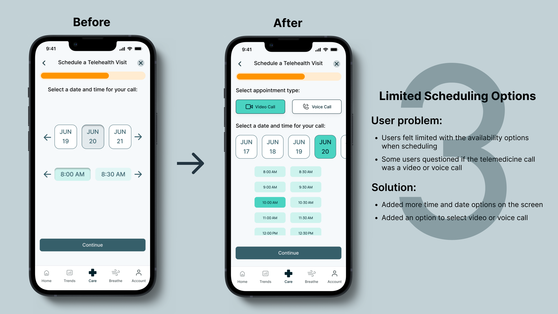
Limited call type and scheduling options
Confusion with multiple medication sections
Unclear medication changes within the post-call summary
Confusing options within the telemedicine reason selection
Iterations
I proposed four major improvements in the design
Based on the feedback from the only round of usability tests, the team and I iterated the designs over for a few days to address the four primary pain points within the telemedicine feature.


Prototype
Give it a try!
Reflections
Takeaways for next time…
Wrapping up my first collaborative project with a client, I am grateful for my wonderful teammates that supported me and provided me valuable insights as a designer and collaborator. Not only that, I was able to utilize my healthcare experience to help advance Purcell’s vision one step closer to reality.
It’s not personal.
As my first collaborative project, I was excited to work with fellow designers, but adapting to different design ideas and skill sets took time. I learned not to take it personally when my ideas weren't chosen, as there was no design lead to guide the team. In the creative field of design, everyone's opinions are valid, and what matters most is achieving the design goal and satisfying the client.
Constant collaboration is key.
Collaboration was crucial while working with a global design team, despite the challenges of time differences and the temptations of wanting to do things myself. I recognized the importance of staying connected, being accountable, and ensuring everyone was updated on progress. This became evident when communicating design decisions to the client and managing feature creep.
Finding the right balance to involve the client.
Striking a balance between involving the client and maintaining the UX design process was essential. While it was important to ensure the client's input, it was also necessary to avoid giving them too much freedom that could hinder progress and lead to feature creep. I learned to be considerate of when to involve the client, and seek their feedback, but also maintain control and provide options that benefited the design team's progress.
Next Steps
Conduct another usability test to validate the design changes and incorporate feedback.
Recommend the next team to independently create the remaining features, create a cohesive user flow unifying everything, and redesign the homepage accordingly.
Prepare the design for developer handoff.